Cell Therapy Scheduling Portal
Patient Scheduling Portal - Rescheduling Indicator & Process Improvement

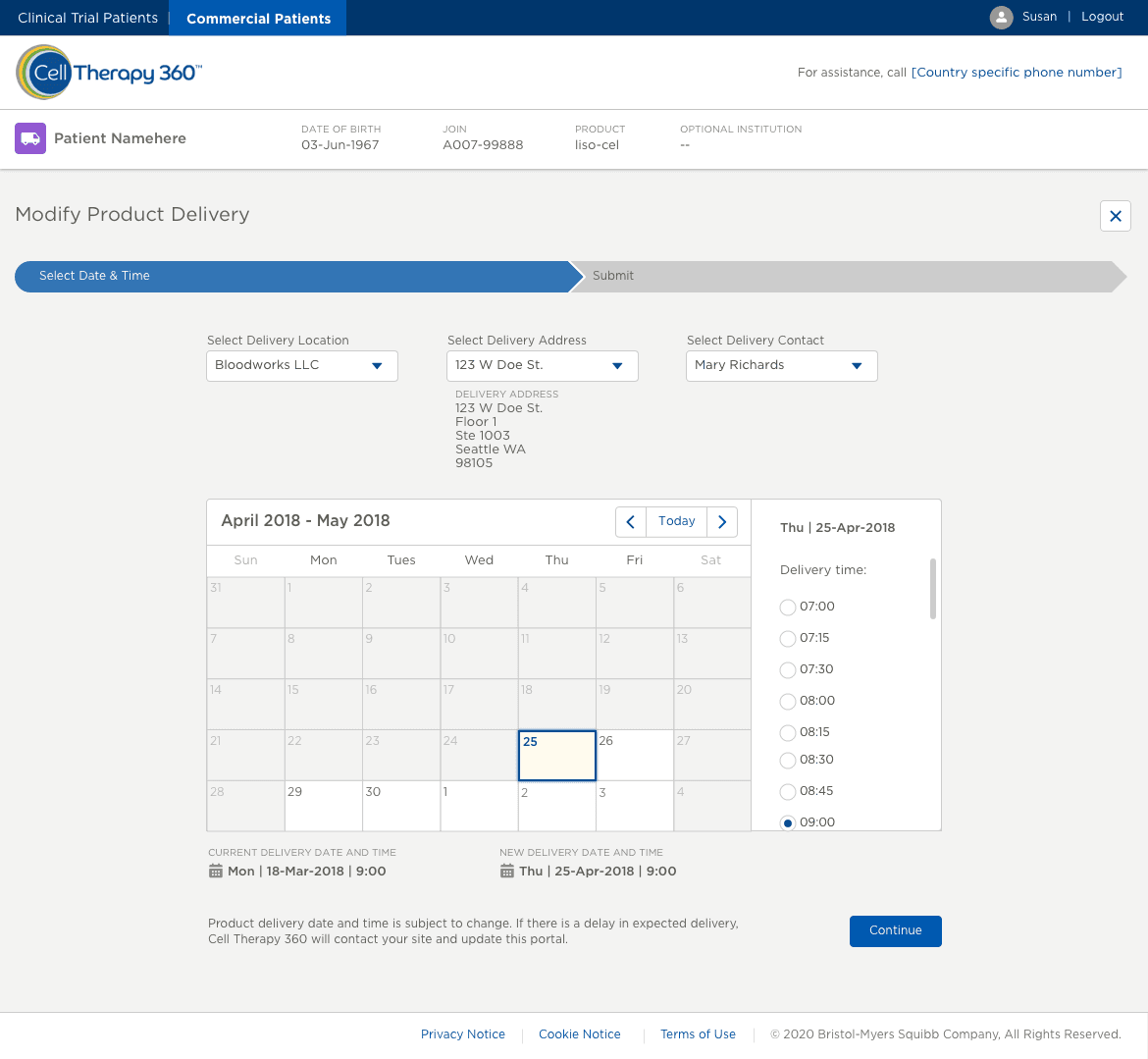
Cell Therapy 360 is a web-based patient scheduling portal built on Salesforce Lightning used by healthcare providers (HCPs), who are treating cancer patients, to schedule the patients for cell therapy treatments.
Timeline
From explorations to release was about a 5-month process
Background
For this iteration of the web app update, there was a need to find a way to indicate when a user makes a change to an appointment on the portal. We needed to continue to display the old scheduling information while also showing the new date and time the user has chosen on the calendar simultaneously. We also need to show a confirmation screen for users to check what they modified before they submit the new date and time.
Analyze current screens and understand the flow of scheduling for product delivery. Evaluate for pain points where users may miss or forget information when in the process of rescheduling. Collaborate with product owners to iterate on mockups. Review Salesforce Lightning Design System to align designs on, as well as the project design library
Research & Analysis
Conducted market research to identify existing scheduling challenges and user preferences. Analyze the scheduling flow for product delivery to develop key functionalities.
Design & Prototyping
Collaborated with product owners to create intuitive user interfaces and high fidelity prototypes. Iteratively refined designs based on user feedback to enhance usability and visual appeal of the product delivery functionalities.
Implementation
Leveraged agile development methodologies to build out the newly updated product delivery functionality and flow. Prioritized feature development based on user feedback, product owner business priorities, and technical feasibility.
Testing & Optimization
Conducted user acceptance testing within the system to ensure compatibility and performance. Gathered user feedback and iteratively optimized the app based on user satisfaction.


The results of the research phase yielded 3 top feedback points I kept in mind while designing the mockups, allowing HCPs to effortlessly manage their patients' schedules and deliveries.
Straightforward UI
HCPs should be able to train quickly on the new flow and process if the UI is straightforward
Simple and legible interface
Using the right colors and fonts to create a simple interface so HCPs are not overwhelmed or overstimulated
Information at a glance
With the previous two key points in mind, these will create an overall interface that allows users to get information they need at a glance before going back to caring for their patients


After the solution went live, end users along with business stakeholders reported several key wins to the team:
Increased Efficiency
Patient Schedulers received lower volumes of calls pertaining to product delivery rescheduling and updates, indicating that the new rescheduling flow added to the system was working as anticipated.
Positive User Feedback
Users reported significant time savings and improved productivity with the new rescheduling flow as they no longer had to call the Patient Scheduling call center to update their product delivery.