social BOOK cataloging APP
Visualizing Reading Habits on GoodReads


(Note: this is an unsolicited feature addition for Goodreads mobile application)
GoodReads is a popular web and mobile application among the bookish community to track books they are reading, have read, want to read, and find new books to read. While GoodReads can show users what books they have read in the past, what they are currently reading, and books they want to read in the future, there are no specific data visualizations available for users to see statistics of their reading.
Timeline
June 2024-August 2024
Background
Coming from a data background, I wanted to add a new feature to an app I commonly use for tracking my reading with visualizations but currently, it does not have a way for me to track my reading stats. I find myself having to use multiple apps to gather the stats I want to know. This was also a chance for me as a designer to create data visualization within a mobile application.
Market Research
I looked into a few different mobile apps the bookish community uses to track their reading. I chose the two other popular reading trackers and used them over the month to understand the types of features they offer, Bookmory and Fable.
Data Viz Solutioning
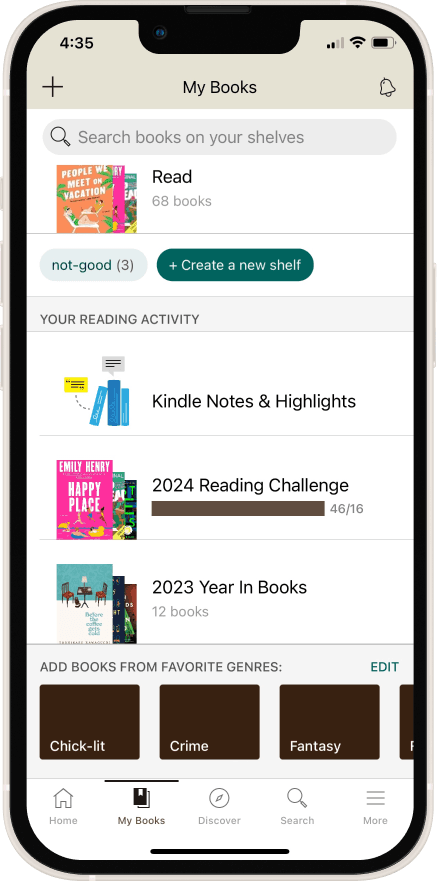
I did a deeper dive into the GoodReads application to understand where in the app specifically an analytics feature would fit in. I focused on the "My Books" tab, which currently provides yearly book stats. This section also includes a user's various reading activities, such as want-to-read list, Kindles notes, etc.
Design & Prototyping
After finalization the types of data I wanted to display, I determined the types of charts and graphs that would best visualize the data and began creating them and adding them to the GoodReads screens.
I tested out a few different mobile apps the bookish community uses to track their reading. I chose the two other popular reading trackers and used them over the month to understand the types of features they offer.


Data Visualizations Solutioning
After finalizing the types of data I wanted to display, I determined the types of charts and graphs that would best visualize the data.
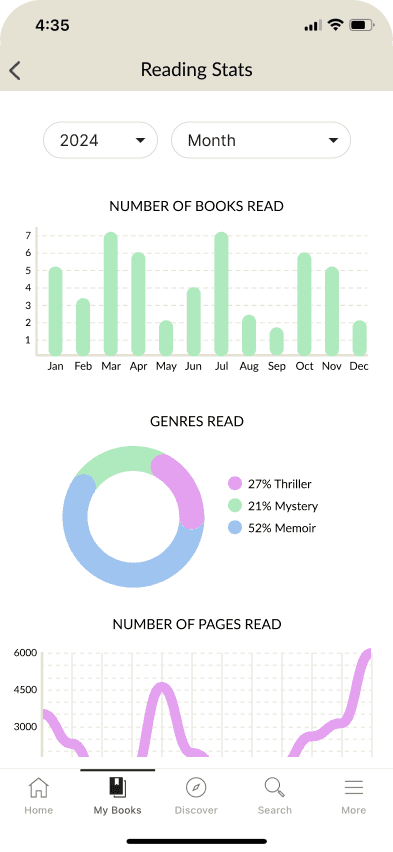
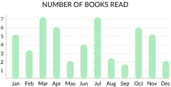
Numbers of Books Read
A bar graph is best used to visualize trends month over month. I chose a bar graph to display the number of books read so users can see how many books they have read for the year compared between each month.
Genres Read
I chose a pie chart to visualize the breakdown of genres read by the user as this gives the best “at a glance” representation of what type of books the user tends to gravitate towards.
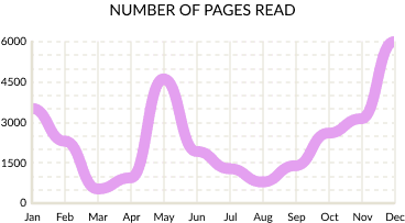
Number of Pages Read
For tracking the number of pages read over time, a line graph helps users visualize that trend month to month.

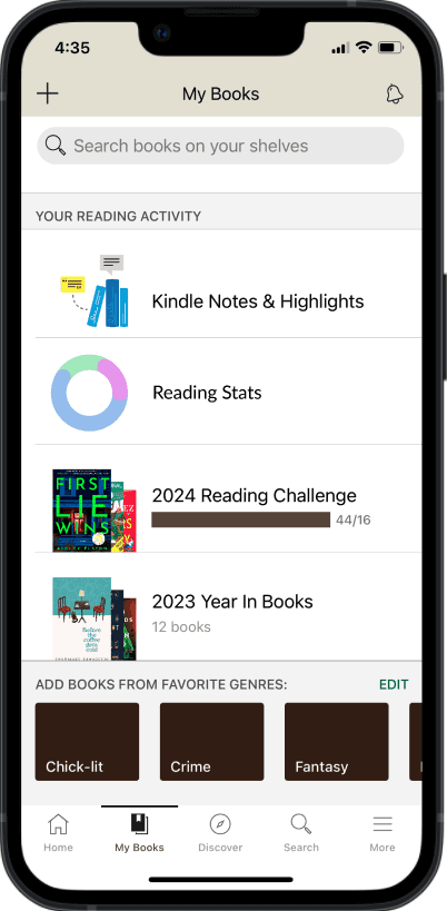
Because the current year-end recap stats currently lives in the My Books tab of Goodread, I chose to keep the new analytics tab there as well as to not disrupt the flow of how users get to their data review.
Interactive Graphs
After clicking on the Reading Stats tab, the user is taken to a new page that displays a list of stats. The user has the ability to filter down by year and by month and changing those parameters will tailor their charts to those dates as well.
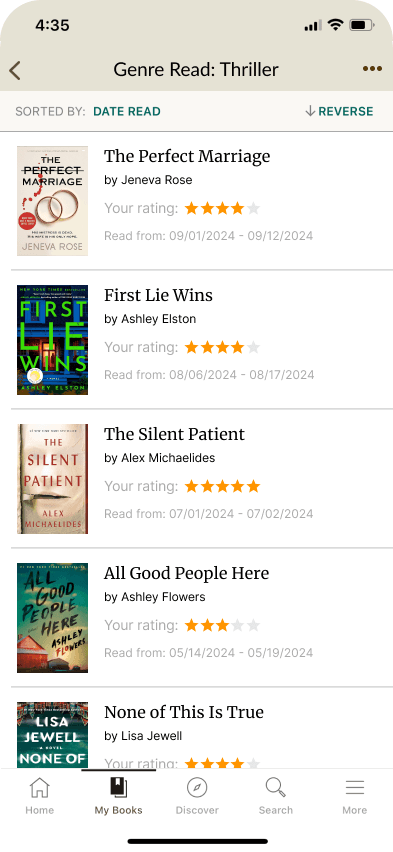
Users can click on parts of the graphs to view books they read in that category. Clicking on a bar in the bar graph will take the user to the list of books they read for in the time period they filtered. Clicking on a piece of the pie chart will take the user to the list of books they read in that specific genre during that time period they filtered..